Hi Stampers

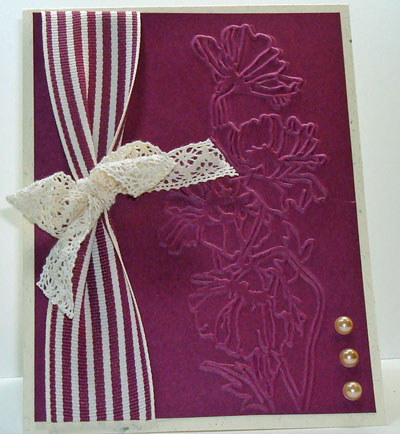
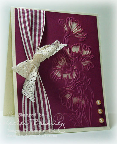
The Flower Garden Textured Impressions Embossing Folder (from the Summer Mini catalog) adds a deep embossed look to the Rich Razzleberry Card Stock. If you are looking for interest, dimension and texture to single layers of card stock, try Stampin' UP!'s beautiful embossing folders.

When I first completed this card, I was not happy with it. It just didn't look finished. Then I while I was getting my daily fill of blogs I follow, I came across Diana Gibbs latest card where she used bleached on colored card stock. I added a few bleached highlights to my card and I was a lot happier with it. Tell me what you think? Do you prefer the first one or the 2nd one (with bleach).
Don't forget – the Free Stamp Set of the Month for April s the Sunny Fun Stamp Set from the Summer Mini Catalog. If you would like a chance to win this set, place an order at my Stampin' Store and your name will be entered in the contest automatically.
Thanks for visiting!
~~Rachel
To purchase any supplies for this card or to shop 24/7, visit my Stampin' Store
Paper: Rich Razzleberry Card Stock (115316), Confetti Cream Card Stock (102835)
Accessories: Rich Razzleberry 1 1/4" Striped Grosgrain Ribbon (119774), Victoria 5/8" Crochet Trim Ribbon (118481), *Flower Garden Textured Impressions Embossing Folder (123113), Big Shoe Die Cut Machine (113439)
*Available 1 May 2011


I really like the bleach effect. I ordered this folder and I am going to have to try this. Thanks for sharing.
Rachel, I so love this card. The bleaching looks awesome.
TypePad HTML Email
Thanks Lisa – I wasn’t sure at first, but the more I look at it, the better I like it!
Rachel BrumleyStampin Up! Demonstrator, ManagerClasses in card making and scrapbookingMy Blog Artistic Designs by Rachel(479) 876-7453rachelbrumley@cox.netContact me today to get your FREE copy of the Summer Mini Catalog and/or the new 2010-2011 Idea Book Catalog
Wow! I couldn’t believe the difference in the 1st card & 2nd! I kept scrolling back & forth. When I saw your first one,… I thought to myself that you were just too hard on yourself, because I loved the simple elegance of #1! Then, I scrolled down to see the bleached effect difference in #2 & totally loved it! What an awesome way of showing how a little technique can make a big difference! Thanks for all you teach us, Rachel! You rock!